I've just gotten my hands on a full MobileMe account (thanks Ramon!) and I thought I'd take the opportunity to compliment and complain.
MobileMe got off to a rocky start. The dotmac website stated that they system would be offline from 8pm-2am beginning Wednesday evening (Jul 9) to facilitate the transition. The presumption was that me.com would go live at 2am, which did not happen. Me.com went through periods of service and through Friday (the day of the iPhone 3G launch). The system became fast enough to be usable on Saturday (Jul 12, the date
It's so shiiiinyyy
Let's get this clear, me.com is pretty. Really, really pretty. It almost feels like a desktop app. You can use keyboard shortcuts just like a desktop app (replace ⌘ key with the ctrl key and you already know the keyboard shortcuts). You can drag and drop just like a desktop app. Windows slide down just like a desktop app. In case you didn't get it, it feels like a desktop app!
Switching between modules requires a load time, but actions within any one of the modules doesn't seem to incur a load time at all (very cool).
Based on SproutCore, MobileMe feels quick. Yet, there are still a few remaining speed issues. I've tried to upload over 5GB of photos to my iDisk via the desktop interface and the transfer has taken 9+ hours to get half way; reading another 9 hours to complete. (This upload later failed; twice.) Accessing the 'account settings' section of the web interface is hit or miss. Sometimes it pops right up, sometimes it just displays "loading" for eternity. No doubt, these are both symptoms of a freshly launched app, nonetheless, they are annoying.
iDisk

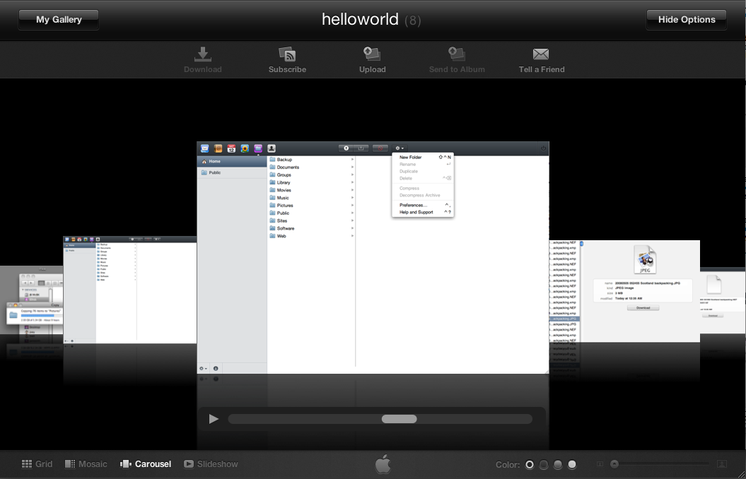
The iDisk webapp works much as you'd expect. It's the same column interface that Finder has. Clicking on a folder reveals the files and directories contained. I haven't figured out the pattern yet, but sometimes the app displays a loading icon you click on a folder, and sometimes it doesn't. Also, the app gives no indication that you've clicked on an empty folder. In contrast, Finder tells the user that a directory has "0 items," the iDisk webapp has no visual indication, and frequently left me watching the computer screen hoping something would load.
The interface does not allow for previewing of files. Click on a jpg and the app will tell you that it's a jpg, but it doesn't display a thumbnail. The system also does not recognize RAW files. It would be nice to have a 'quicklook' like functionality so that a user didn't have to download a file to see what it is.


Preferences for iDisk are extremely simple. You have the choice of displaying a 'Simple Folder Layout' - only Documents, Public and Movies are shown in iDisk home. The app behaves as you'd expect it too, and in someways is more responsive than the desktop plugin. Which is continually having connection issues. It seems that my iDisk can't stay connect for more than several hours at a time – no big deal until I try to transfer several gigabytes of files.
Deleting files on the iDisk via the desktop takes a very long time. But, the process is fast on the web app, and the changes are reflected nearly instantaneously on the desktop side.
In addition, I was surprised to see the webapp lacking two key features. 1) It is not capable of uploading directories, even though it can upload multiple files. The help instructs users to compress (zip) their directories first – what a poor solution. 2) Even though Contacts and Mail have instant search, iDisk does not. erm… makers of Spotlight – HELLO! I'd like to be able to search my files online too please. K, thanks.
I was impressed at the integration, but constantly frustrated by webapp limitations and the glacial communications times when using the desktop interface. iDisk is not ready for large file transfers but with luck, Apple will fix the bugs and speed will increase in the near future.
Gallery

Gallery is the me.com interface for hosting your photos. Think of it as the web based iPhoto.
The frontend is the same that users have come to know and love. It's extremely fast, good looking and offers a variety of options to viewers.

Uploads are very quick and the interface not only allows the user to upload multiple files at once, but has the option to add more files while an upload is in progress - nifty!
It's possible to sync Gallery with either Aperture or iPhoto but, in my opinion, there is one glaring sync error. Apple gives MobileMe users 20GB of storage to divide between email, iDisk, Gallery, and Backup. 20GB may seem like a lot but when all of these services are taken into account, the space goes fast. Ideally, MobileMe could offer users a complete cloud storage solution for all data. 20GB is simply not enough to accomplish that.
Following that logic, Apple should allow Gallery to use photos placed in the Pictures folder of iDisk. Not only would this ease the storage constraints, but it would simplify the interface between the two apps.
It's worth noting that Gallery has no photo editing capabilities or instant search. I don't think these are features that many users will miss, but as search is a key Apple technology and web-based photo editing is becoming more popular, it would have been nice for Apple to through those features in.
And that is as far as my complaints with Gallery go. It is otherwise and extremely well designed and extremely responsive app.
Calendar

Calendar isn't quite as slick as iCal, but it's still the slickest calendar interface I've seen to date. It has all the simplicity of gCal with fewer pages loads. (Less pages loaded means the app is faster.)
Notably, Calendar falls into the class of MobileMe apps that could use instant search and curiously doesn't have it.

While Calendar has no trouble syncing your iCal calendars, it does not import your subscription calendars. I can't fathom why this is, but it sure is annoying to not have holidays visible.
Aside from the different info panel, Calendar does maintain an interface virtually identical to iCal. This means that Calendar shares the same flaw that I find with iCal - it has poor support for ToDo items. As a simple list, ToDo is horribly uncomplicated and hard to use. There's no way to attach a todo to an event, one can't postpone todo items, and there is no method to group tasks with multiple calendars. Nonetheless, Calendar does what it's supposed to do elegantly and without trouble.
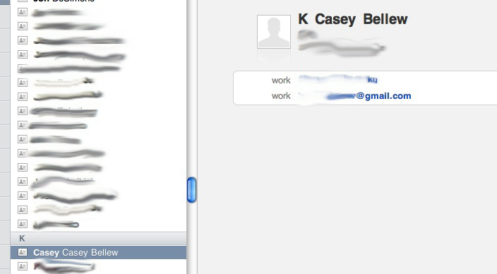
Contacts

Contacts should be the simplest app in the suite. Or at least, it makes sense to me that a simple database interface would be ease to do. …so of course, it fell to the bottom of the maintenance list.
My first sync (on Friday) caused some of my contacts to duplicate. I'm not sure why some duplicated and some didn't, but it was sure annoying and not what I expected from a first class sync app. Once I got that problem taken care of, I headed over to the webapp and tried dealing with my contacts there.
As with the rest of the me.com apps, Contacts online is very similar to contacts on the desktop. One glaring thing that is missing the smart contact groups. Normal groups show up online fine, but it's a strange thing to be missing when the instant search works so well. (whoohooo! instant search!)
One strange bug I encountered was that editing a contact name didn't always update the name in the contact list.
I won't say that Contacts is bad, far from it - it looks to be a promising web interface. But, it sure is buggy.

Let me start by saying this. I really prefer desktop apps for email – I want the ability to search and write messages while offline. To accomplish this, I use Apple's Mail.app. But, I've used Yahoo, AOL, gmail, Comcast, squirrel mail, and a host (20+?) of other email webapps.
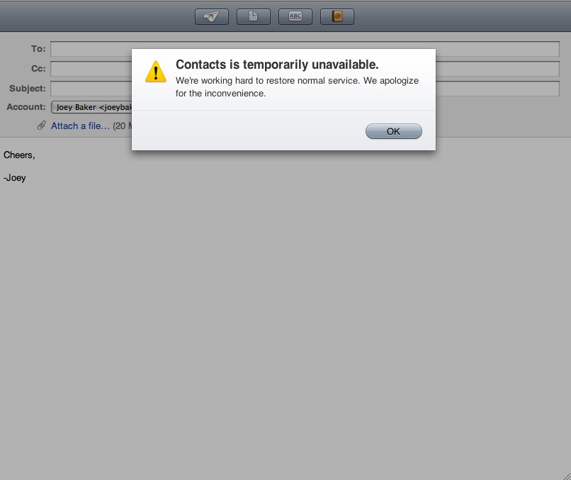
Let me say this, for all it's simplicity and flash, the new MoblieMe email app sucks. I like the instant search, but aside from that, there are a lot of serious flaws.
Mail doesn't import other email accounts. The reason I so like Mail.app is that I can have a ton of email accounts in it. I've got 6 active right now. They all do different things and I don't want them confused. Now maybe I'm unique in that respect, but I still want Mail's web interface to show those other accounts. I was quite surprised to find that it didn't. After all, gmail does it.
Mail doesn't support smart folders. Not too much of a surprise in light of Contacts not supporting smart groups, but very disappointing. But, Mail has instant search!
New Message opens a popup. Really Apple? really? Didn't you learn anything from AOL's mistakes and Gmail's success? Lets keep everything in one window, mhhhkay?
New Message doesn't auto-complete the "To:" field. Granted, I ran into this problem when I clicked on the address book, but that doesn't indicate that auot-complete wasn't working. This seems to be an obvious feature that everybody uses.
I count myself lucky that I don't depend on me.com as my primary email. The webapp is easily the weakest in the suite, and needs quick updating.
Other nifty things
In general, the help provided is very good. Clicking on a help link or pressing [ctrl+?] launches a new popup (appropriate in this case) which loads faster than OSX help windows do!
I did all of my testing in Safari Version 3.1.1 (5525.20), so your mileage in a different browser may vary. I'm very interested to know how IE deals with me.com.
You can set me.com to remember who you are for 2 weeks at a time, a good security measure.
This is way improved over dotmac.
It's possible to setup your own domain name to point to your homepage. That means you can get your iWeb site to live at its own URL.
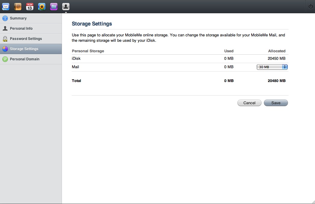
Users can set how they divide storage between their email and their iDisk –very handy!
Aside from where I specifically mentioned, the me.com is fast. Load times are negligible and speed should only increase as Apple works out the kinks.
Syncing a computer with MobileMe is similarly speedy, I could be mistaken, but it seemed snappier than the dotmac sync.
What I really think...
I'm horribly disappointed with iDisk. I really expected better from a cloud storage solution. For now, I'm sticking with Wua.la. I don't doubt that Apple will work out the kinks, but right now, it's broken.
Gallery, Contacts and Calendar are really nifty apps that are well done, but have several bugs.
Though usable, Mail needs a lot of work. Stick with gmail, Yahoo, or a desktop client.
Now for the million dollar question. Is it worth $100 a year?
- Do you need to host a website or share you pictures online, but have little technical know-how?
- Do you already have a dotmac email address?
- Do you want a really slick way of showing off your photos and videos?
- Do you need a really simple way to sync two computers?
- Do you want a set-it-and-forget-it strategy to get an offsite backup of your most essential data?
If you answered yes to any of the above, give me.com a serious think. Note I didn't ask if you need a way to get your calendar, or contacts, or email, or photos, or data, online. There are free solutions for all of these, they're just far more manual than MobileMe.
I really appreciate the approach of MobileMe. And incase you didn't catch it, the interface is slick! I trust that once all of the bugs are worked out, life @me will be really sweet.
A totally arbitrary rating, for those that need a number: 7.45/10
Update
AppleInsider raises an interesting point that I completely missed. MobileMe is marketed as a push solution for all your devices, and it fails at this goal. Though changes made on an iPhone are apparently recognized instantly by the cloud, changes made on a Mac still need to be synced. That is not a push solution, not at all. I suspect that the next version of OSX aliviate, if not fix this issue with support for exchange built into all the necessary apps. Nonetheless, it is a severe disappointment to not have push now – as was promised. Syncing is a 2nd class solution, especially when it duplicates my contacts!
Update 2
Check out this for a great look at how Apple is fixing the problem.